


Reducing the environmental impact of Windows devices
Read more-
April 26, 2024
Manor Lords out now via PC Game Pass
-
April 17, 2024
PC players of Grounded can now team up with others across platforms
-
April 16, 2024
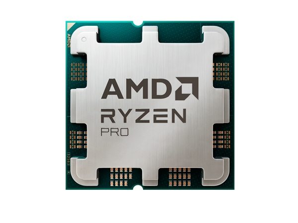
AMD’s commercial AI PC portfolio integrates Microsoft Pluton, includes Microsoft Copilot
-
March 21, 2024
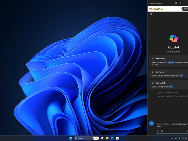
Copilot in Windows and Windows 365: Helping customers advance in the new era of work


Windows 11
Get to know Windows 11, the Windows that brings you closer to what you love.


Windows Experience
News and features for people who use and are interested in Windows, including announcements from Microsoft and its partners.


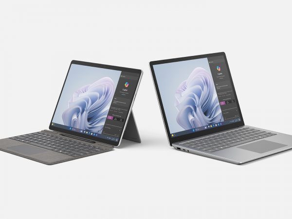
Devices
News and more about hardware products from Microsoft, including Surface and accessories.


Windows Developer
Guidance to help developers create products and services based on the Windows platform.


Microsoft Edge
News and product updates for developers focused on Microsoft Edge.
Windows Insider Program (WIP)
Updates and announcements for members of the Windows Insider Program.